 i've also posted up the official olympic stamps for the united kingdom which feature colourful flat graphics designed by paul smith.
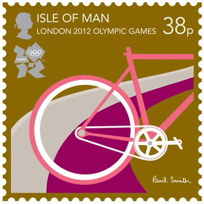


 i've also posted up the official olympic stamps for the united kingdom which feature colourful flat graphics designed by paul smith.


2 comments:
I, like you, didn't like it at first but have grown to love it over the years.
Think they were right to break with the style of the proceeding couple of decades (which had been used in the candidate city logo) and go for something different.
The turning point in my general appreciation of the logo was the Union Flag version which (if I remember correctly) first appeared on the Mall for the Closing Ceremony in China and the handing over of the Olympic flag.
I love love love the Paul Smith stamps
Post a Comment